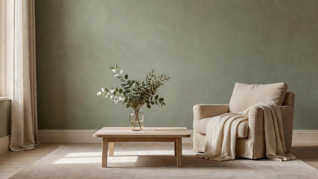
Choosing paint colours for a calm home starts with how you want each room to feel. Soft neutrals, gentle greens, serene blues, and warm earth tones can create a restful backdrop without making a space feel flat. Consider how natural textures, room lighting, and changing daylight affect each shade. Testing a few paint samples on your walls can help you avoid surprises and find colours that suit your home. If you’d like a second opinion, Property Sisters Interiors can offer expert guidance.
Key Takeaways
- Choose warm whites, soft beige, or pale greige for a restful, versatile backdrop that works well in many rooms.
- Use muted sage, soft olive, or fern green to bring a gentle, nature-inspired feel to your home.
- Try softened blues with gray or warm undertones for a calm bedroom or a welcoming living space.
- Add terracotta, soft clay, rust, or ochre for cozy warmth, and balance these richer shades with natural textures like wood and linen.
- Test large paint samples in each room and observe them in different lighting throughout the day for several days before making your choice. For help narrowing down colors, consult Property Sisters Interiors.
How to Choose Calming Paint Colours

Choose calming paint colors by considering how you want a room to feel and how its light changes throughout the day. Cool hues can feel restful, while warmer shades may create a gentle sense of comfort.
Consider the room’s purpose, too: a bedroom might benefit from a quieter atmosphere, while a workspace may call for a calm color that still feels clear and energizing.
Test samples on more than one wall, and observe them in morning, afternoon, and evening light. Light bulbs and nearby furnishings can affect how a color looks.
Pay attention to how each shade makes you feel instead of relying on trends or paint names. A calming color is one that suits your habits and feels pleasant over time—you don’t need to find a single perfect shade.
If you’d like help choosing, Property Sisters Interiors can offer expert guidance.
Soft Neutrals for a Calmer Home
Soft neutrals can make a home feel calm without feeling cold or stark. Choose warm whites, gentle beiges, or pale greiges for a restful backdrop that still feels welcoming. Test paint samples on several walls, since daylight and artificial light can change how a shade looks.
Consider how the undertones work with your flooring and furnishings: creamy white can soften wood, while balanced greige can bring mixed materials together.
Build a complementary color palette with muted tones already in your decor, such as soft taupe cushions or natural linen curtains. Texture and finish also shape the mood. Pair matte walls with woven fabrics, smooth wood, or subtle ceramic accents to add depth without visual clutter.
For a brighter look, use satin sparingly on trim to reflect light while keeping the overall effect gentle. If you’d like help choosing colors and finishes, Property Sisters Interiors can offer expert guidance.
Gentle Greens for a Nature-Inspired Feel
Gentle greens can give your home a quiet, nature-inspired feel without overwhelming a room. Consider sage, soft olive, or muted fern—botanical shades that are easy to live with. For a more subdued look, choose a green with gray or earthy undertones. A lighter shade can help a small room feel more open.
Before committing, test paint samples on several walls and check them at different times of day. Natural light can change how a green looks, and warm bulbs may bring out yellow undertones.
Pair your chosen shade with wood, woven textures, or a few plants for a grounded palette. You don’t need to match a leaf exactly; a softened green can evoke nature without making the room feel themed.
If you’d like help choosing a shade, Property Sisters Interiors can offer expert guidance.
Serene Blues for Restful Rooms
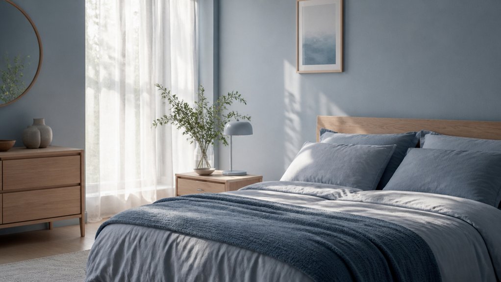
Soft blue can make a bedroom feel restful without feeling cold.
In living spaces, muted blues bring a sense of calm while keeping the room welcoming.
Choose a shade that works with your natural light and furnishings for a balanced, relaxing look.
For help finding the right blue, reach out to Property Sisters Interiors.
Soft Blue Bedrooms
Soft blue can make a bedroom feel restful without making it seem cold. Often associated with open skies and quiet water, muted blues bring a sense of calm without overpowering the room.
If your bedroom gets strong daylight, try a blue with a hint of gray. In a darker room, a slightly warmer blue may feel more inviting.
Test paint samples near your bedding, and check them in both morning and evening light. Window direction and lightbulb color can noticeably change how a blue looks.
For walls, washable matte paint can soften the appearance of minor imperfections, while eggshell is typically easier to wipe clean.
Pair your chosen shade with warm wood, cream linens, and gentle lighting for a comfortable, personal retreat.
If you’d like help choosing colors and finishes, Property Sisters Interiors can offer expert guidance.
Muted Blue Living Spaces
To create a restful living space, consider muted blue. A shade with gray or green undertones feels softer and pairs well with warm wood, cream upholstery, and natural textures.
Blue is often associated with calm and focus, making it a thoughtful choice for rooms where you relax or spend time with family.
Before committing, test paint samples on more than one wall. Daylight and evening lighting can make the color look quite different.
Also consider the finish: matte can help disguise minor wall imperfections, while eggshell adds a subtle sheen and is typically easier to clean.
If the room feels cool, bring in warm lighting, woven accents, and earthy details to make it more inviting.
For help choosing a shade and pulling the room together, Property Sisters Interiors can offer expert guidance.
Warm Earth Tones for a Cozy Retreat
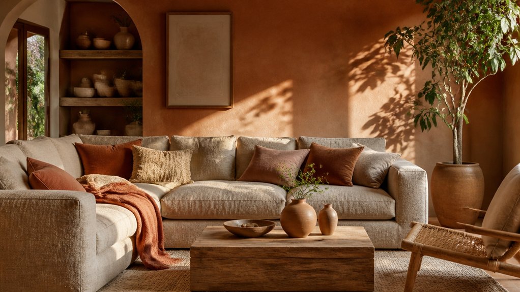
Warm earth tones can make your home feel more inviting while keeping the palette calm. Try terracotta for a gentle glow, or choose soft clay neutrals for a quieter backdrop.
An earthy accent wall can add depth and keep the room feeling cozy and balanced.
For help choosing colors that suit your space, reach out to Property Sisters Interiors.
Terracotta Warmth
Terracotta brings the grounding warmth of sunbaked clay to a room, creating a cozy retreat without feeling overpowering. Its earthy red-orange tones can make a living room, dining nook, or bedroom feel welcoming and settled.
Choose a muted shade for a softer effect, or a deeper terracotta to add definition to an accent wall.
Its connection to handcrafted materials and sunlit landscapes gives terracotta a timeless, natural feel. You don’t need to use it everywhere: pair it with natural wood, woven textures, or simple furnishings to keep the room balanced.
Test a sample in both morning and evening light, since the color can shift throughout the day. If it feels too intense, try it on one wall or in a smaller space where you want a snug, restorative atmosphere.
For help choosing a shade and coordinating finishes, Property Sisters Interiors can offer expert guidance.
Soft Clay Neutrals
Soft clay neutrals bring the gentle warmth of earth into a room without the boldness of terracotta. Their muted blend of beige, blush, and brown creates a grounded, welcoming backdrop.
Try these shades in bedrooms, living rooms, or reading nooks for a comfortable feel that still feels light and airy.
Warm undertones can make a space feel restful, while restrained color keeps the mood calm. Test paint samples at different times of day, since natural and artificial light can change how a shade looks.
For a smooth, lasting finish, clean and prime the surface, then apply two thin coats with a quality roller.
Pair the color with natural textures and soft lighting to create a serene retreat.
If you’d like help choosing a shade or pulling the room together, Property Sisters Interiors can offer expert guidance.
Earthy Accent Walls
When you want a room to feel cozy without darkening every wall, try an earthy accent in rust, ochre, olive, or deep clay. These warm shades add depth while keeping your retreat welcoming. Choose a wall that naturally draws attention, such as the one behind your bed or sofa.
Test paint samples in both morning and evening light, since earthy colors can shift throughout the day. Balance a bold accent with soft clay neutrals or warm whites on the remaining walls to keep the room restful rather than crowded.
Echo the accent subtly with accessories such as cushions, a ceramic vase, or a throw. For thoughtful wall art placement, leave breathing room around frames and choose pieces that complement the wall’s undertone.
For help choosing colors and finishes, Property Sisters Interiors can help you create a cozy focal point that feels right for your space.
How Lighting Changes Paint Colours
Light can make a paint color look warmer or cooler, softer or more vivid—and sometimes like an entirely different shade. Natural light shifts throughout the day: morning light may bring out cooler undertones, while late-afternoon sun can make a wall feel warmer.
North-facing rooms typically receive cooler, softer light, while south-facing rooms tend to feel brighter and warmer.
Artificial lighting matters, too. Warm bulbs can emphasize reds and yellows, while cooler bulbs may bring out blues and greens.
Paint finish also affects how a color reads: glossy paint reflects more light, while matte paint absorbs it and often looks softer.
As you choose a calming palette, test paint samples in your room and check them at different times of day under both natural and artificial light.
If you’d like help choosing colors that suit your space, Property Sisters Interiors can offer expert guidance.
Test Calming Colours in Each Room
Test Calming Colors in Each Room
Lighting can change how a paint color looks, so test samples in each room before you commit. Paint large swatches on several walls or use movable boards you can reposition. Check the colors in the morning, at midday, and after dark with your usual lamps on.
Notice how each shade looks alongside your flooring, furniture, and fabrics; the mood a color creates depends on both the hue and its surroundings.
Give samples a few days before deciding. A soft blue may feel restful in a bright bedroom but look chilly in a shaded study. Try warm neutrals for a welcoming feel and muted greens for a gentle connection to nature.
Pair your favorite shade with mood-enhancing textures, such as linen or wood, to create a calm, balanced room. For help choosing colors and finishes, you can consult the experts at Property Sisters Interiors.
Frequently Asked Questions
Are Low-Voc Paints Better for Indoor Air Quality?
Yes, low-VOC paints can help improve indoor air quality because they typically release fewer pollutants during application and curing. Choose low-emission finishes, ventilate the room well, and follow the label directions. Low-VOC doesn’t mean emission-free, so good airflow still matters. For help choosing finishes, contact Property Sisters Interiors.
What Paint Finish Is Easiest to Clean?
Semi-gloss paint is typically one of the easiest wall finishes to clean. Its smooth, durable surface resists stains and can be wiped down, making it a practical choice for busy rooms. For a polished result, prepare the walls carefully and test paint samples to find the right sheen for your space. Property Sisters Interiors can help you choose the right finish.
How Can I Prepare Walls Before Painting?
Move furniture away from the walls and cover floors and nearby items. Fill nail holes and small cracks, then sand rough patches smooth. Wash the walls with mild soap and water, and let them dry completely before applying primer. Use painter’s tape along trim and other edges for clean, crisp lines. If you’d like a hand getting your walls ready, Property Sisters Interiors can help.
Can Calming Paint Colours Increase a Home’s Resale Appeal?
Yes, calming paint colours can boost resale appeal by helping buyers picture themselves in your home. Choose neutral, soothing shades to create a welcoming, cohesive look that feels move-in ready. For expert help selecting a palette, contact Property Sisters Interiors.
How Often Should Interior Walls Be Repainted?
Interior walls typically need repainting every five to seven years, though busy rooms may need attention sooner. Look for scuffs, fading, or peeling, and consider paint durability when deciding. For help choosing colors and timing your project, contact Property Sisters Interiors.
Conclusion
A calm home doesn’t require a complete makeover. Start with soft neutrals, gentle greens, serene blues, or warm earth tones, and choose shades that feel right for your space. Test paint samples in each room, observing them in natural and artificial light throughout the day. Natural textures and thoughtful lighting can help bring the palette together. The best color is the one that helps you exhale when you walk through the door. Begin with one room, trust what you see, and create a home that feels like a quiet refuge. For expert guidance, reach out to Property Sisters Interiors.