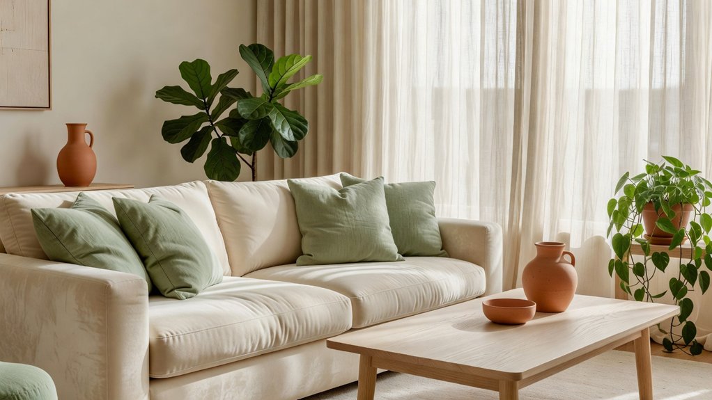
A calm, inviting living room doesn’t have to be all beige. Choose colors that work with your natural light, then layer warm neutrals, muted greens, soft blues, or earthy tones with natural textures. A thoughtful mix can feel restful without looking flat, and even a small accent can shift the mood of the whole room. For help finding a palette that fits your home, Property Sisters Interiors can offer expert guidance.
Key Takeaways
- Start with warm white, soft beige, or pale greige walls to create a calm, versatile foundation.
- Pair sage with cream or olive with warm neutrals for a soothing, nature-inspired look.
- Choose muted blues or soft pastels for a serene feel, then balance them with creamy tones and warm wood.
- Add depth with terracotta, rust, or cinnamon accents in cushions, artwork, or ceramics.
- Layer linen, wool, wood, and warm lighting to add texture without visual clutter. For help choosing a palette that suits your home, Property Sisters Interiors can offer expert guidance.
Calm Neutral Living Room Palettes
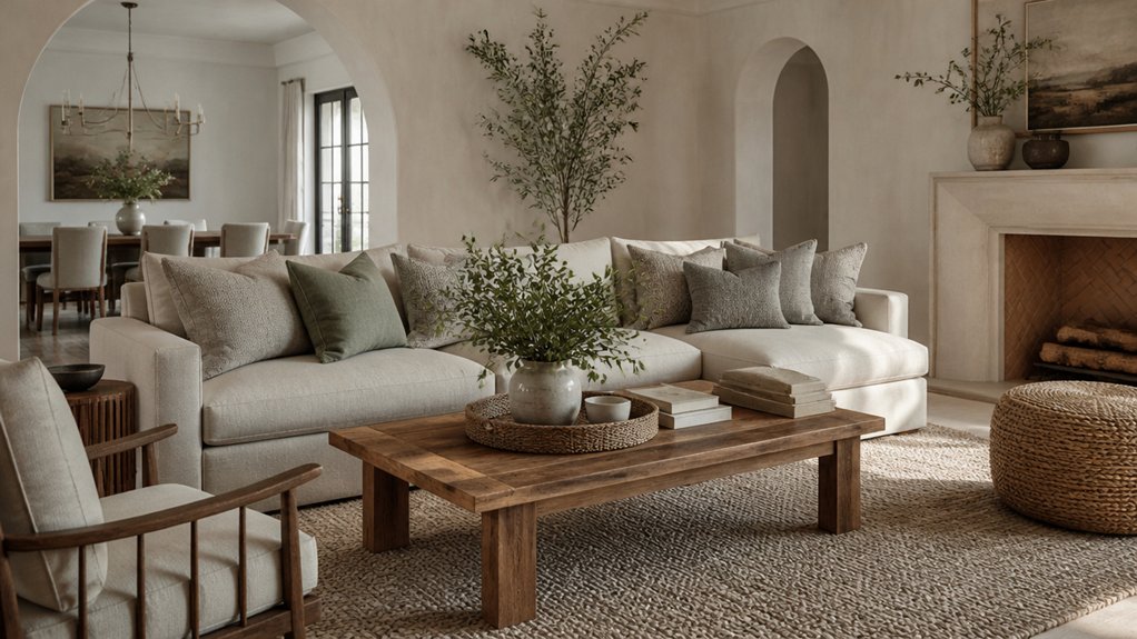
Calm neutral palettes create a restful living room without making it feel flat. Start with warm white, soft beige, or pale greige walls, then layer in natural textures for depth. Try linen curtains, a wool rug, and wood furniture in complementary tones. This restrained mix keeps the room inviting while giving your eye places to rest.
Use color psychology to guide your choices: warmer neutrals tend to feel welcoming, while cooler stone shades create a quieter mood. For an accent wall, try a subtle shift in tone, such as mushroom behind the sofa, instead of a stark contrast.
Add definition with charcoal frames, dark bronze hardware, or a few black accents. Repeat each accent around the room so the palette feels intentional, not scattered. Test paint samples in different daylight conditions before committing.
If you’d like help bringing the palette together, Property Sisters Interiors can offer expert guidance.
Relaxing Green Living Room Palettes
Green creates a calm, restorative feel in the living room without making it seem cold. Pair sage with cream for a light, airy palette, or combine olive with warm neutrals for more depth.
Natural wood adds warmth and helps ground green walls or upholstery. For help choosing a palette that suits your home, reach out to Property Sisters Interiors.
Sage and Cream Pairings
Sage and cream create a restful living room palette, pairing muted green’s natural softness with the warmth of an off-white neutral. Use muted sage on the walls or a large sofa to establish a gentle, grounded backdrop. Then layer in creamy accents with curtains, cushions, a wool rug, or a softly upholstered chair. This balance keeps the room light without feeling stark.
Vary textures to add depth while staying within the palette: combine linen, bouclé, smooth ceramic, and natural wood. If your room gets limited daylight, choose a pale sage and warm cream to help preserve brightness. In a sunlit room, a deeper sage can add welcome definition.
Repeat each shade in a few places to make the scheme feel intentional, then finish with restrained greenery or artwork in quiet, complementary tones. For help bringing the palette together, you can consult Property Sisters Interiors.
Olive With Warm Neutrals
Olive adds more depth than sage, while warm neutrals keep a living room relaxed and inviting. Try olive on a feature wall, sofa, or curtains, then balance its richness with ivory, oatmeal, or soft taupe. These lighter shades help reflect daylight and keep the palette from feeling heavy.
For a cohesive look, repeat each color in small touches across cushions, artwork, and rugs.
Add warmth with complementary accents such as muted terracotta, dusty rose, or aged brass. Keep them restrained: one or two accent shades are usually enough for a considered finish.
For more dimension, pair smooth painted surfaces with nubby upholstery, woven cushions, or a softly patterned rug. The result is a layered, restful room that feels polished yet comfortable.
If you’d like help bringing the palette together, Property Sisters Interiors can offer expert guidance.
Green and Natural Wood
Pairing soft green with natural wood creates a living room that feels calm and grounded. Choose muted sage or eucalyptus for the walls, then balance it with pale oak, walnut, or ash. Wood furniture adds warmth and texture, keeping the palette from feeling cool or flat.
For a lighter look, pair sage walls with a blond-wood coffee table and woven accents. For more depth, try forest-green cushions against a walnut sideboard.
Layer in cream or warm white with curtains, rugs, and upholstery to keep the room bright. Indoor plants reinforce the connection to nature, while varied leaf shapes add subtle contrast.
Repeat wood tones in picture frames or shelving for a cohesive finish. Keep finishes matte and the decor uncluttered so the palette feels restful rather than rustic.
If you’d like help bringing the look together, Property Sisters Interiors can offer expert guidance.
Warm Earth-Tone Living Room Palettes
Warm earth tones can make a living room feel grounded and welcoming without making it seem dark or heavy. Try soft clay, muted terracotta, or warm taupe on the walls, then layer in cream upholstery and natural textures. This balance keeps the room inviting and gives each shade room to breathe.
For an accent wall, consider deeper rust or cinnamon behind the sofa, and repeat that color in pillows or artwork for a cohesive look. If your room gets limited daylight, choose lighter finishes for larger furniture pieces to help preserve an open, airy feel.
Earthy reds can add gentle energy, while sandy neutrals create a more relaxed mood. Finish with aged brass, woven details, or dark wood for contrast, and use warm, layered lighting to bring out the palette’s rich undertones.
For help choosing colors and finishes, you can consult the experts at Property Sisters Interiors.
Peaceful Blue Living Room Palettes
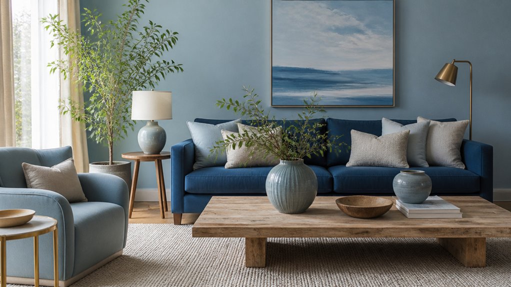
Soft blue can give a living room a calm, airy feel without making it seem cold. Choose a muted shade with gray undertones for the walls, then add depth with navy cushions or a deep blue rug. These darker accents anchor the room and keep the palette from feeling washed out.
Balance blue with warm, natural materials such as oak furniture, woven baskets, or a linen sofa. For a Mediterranean-inspired look, add terracotta pottery, aged brass, and creamy stone.
For a coastal feel, pair blue with crisp white, pale wood, and subtle stripes instead of overt nautical motifs.
Test paint samples in both morning and evening light before committing, since blue can shift noticeably throughout the day. Keep larger surfaces restrained, then use smaller accessories to add contrast and personality.
For help choosing colors and finishes, you can consult the experts at Property Sisters Interiors. This approach creates a composed, welcoming room that feels fresh year-round.
Gentle Pastel Living Room Palettes
Gentle pastel colors can soften a living room without making it feel washed out. Pair blush with sage for a warm, grounded look, or combine pale blue and lavender for an airy, cooler palette.
Add warm wood, creamy neutrals, and simple textures to keep the room balanced.
For help choosing colors and finishes, reach out to Property Sisters Interiors.
Soft Blush and Sage
Blush and sage create a calm living room palette that feels fresh without turning sugary or overly botanical. Use warm blush on a sofa, curtains, or a feature wall, then balance it with muted sage on cushions, cabinetry, or a painted side table. Together, these colors bring warmth and a grounded, restorative feel.
Keep larger surfaces light and neutral so the pastels feel refined. Cream, pale oak, and natural linen provide an easy backdrop, while brushed brass or dark wood adds definition.
Choose a deeper accent, such as olive or terracotta, to keep the scheme from feeling flat. In a room with cool daylight, lean toward warmer blush; in a sunny space, choose a grayer sage for balance.
For help tailoring the palette to your home, Property Sisters Interiors can offer expert guidance.
Pale Blue and Lavender
Pale blue and lavender create a serene living room palette with a cool, airy feel. Use pale blue on larger surfaces, such as walls or a sofa, then add lavender through cushions, throws, or artwork. This balance keeps the room restful without making it feel cold or overly sweet.
Ground the pastels with warm wood, cream, or soft gray. Muted sage or brushed brass accents can add definition while preserving the gentle mood. Repeat each shade in a few places to make the palette feel intentional.
Layer warm-white lighting to bring out the colors’ softness. Combine table lamps with indirect light, such as a floor lamp aimed at a wall. In north-facing rooms, a cream rug or linen curtains can help make the most of available light. Keep patterns subtle and use texture to add interest instead.
For help choosing colors and finishes that work together, Property Sisters Interiors can offer expert guidance.
Choose Living Room Colours for Your Light
How much natural light your living room gets should guide your color palette. In a sunlit space, cool whites, soft grays, or muted blues can soften the brightness without making the room feel stark. Test paint samples on different walls, since daylight can shift in tone from morning to evening.
If your room faces north or gets little sun, warm neutrals, creamy whites, or gentle terracotta can create a welcoming glow. Pale colors may help a small, dim room feel more open, while deeper shades can add a cozy, cocooning feel.
Choose bold accent walls carefully: saturated colors can absorb light, so consider using them on a well-lit wall. After dark, let statement lighting complement your palette, and check samples under both natural and artificial light before committing.
For help choosing colors that suit your space, Property Sisters Interiors can offer expert guidance.
Balance Living Room Colours and Textures
Balance color and texture to give your living room depth without making it feel busy. Start with a calm base, such as warm white, soft taupe, or muted sage, then layer tactile materials in complementary tones. A nubby wool rug, linen curtains, and a smooth wood table create contrast without competing for attention.
If you choose a bold accent wall, keep nearby furnishings simple. Repeat the wall color in small touches, such as cushions or ceramics, to make the palette feel intentional. Vary finishes, too: matte paint adds softness, while glass or brushed metal can bring in a little light.
Limit strong patterns to one or two pieces, and let texture do the rest. The result is a welcoming space that feels considered, comfortable, and quietly distinctive. For help bringing the colors and materials together, Property Sisters Interiors can offer expert guidance.
Frequently Asked Questions
How Can I Test Paint Colours Before Committing to a Full Room?
Test paint colours by applying large swatches to different walls, then check them in the morning, afternoon, and evening. Natural and artificial light can change how a shade looks, so observe each sample before painting the full room. For help choosing a colour, you can consult Property Sisters Interiors.
Which Paint Finish Is Easiest to Clean in a Living Room?
Choose satin for an easy-to-clean finish with a soft glow. Satin and semi-gloss typically resist stains and wipe clean with a damp cloth, but satin is more forgiving of minor wall imperfections. For help choosing the right finish for your living room, contact Property Sisters Interiors.
How Often Should I Repaint My Living Room?
Repaint your living room every five to seven years, or sooner if the walls are scuffed, faded, or looking worn. Choose a color that suits the mood you want to create, and plan the work for a season when you can comfortably ventilate the space. For help choosing colors or planning your project, contact Property Sisters Interiors.
Can I Use Different Wall Colours in an Open-Plan Living Area?
Yes. Different wall colours can help define dining and lounging areas while keeping an open-plan space cohesive. Try related shades for subtle separation, or use a contrasting colour to mark a distinct zone. Test paint samples in different lighting throughout the day. For help choosing a palette, contact Property Sisters Interiors.
How Can I Coordinate Living Room Colours With Existing Furniture?
Start with the dominant colors in your existing furniture, and choose wall colors that work with their undertones. Bring in complementary accents through pillows, art, or rugs, then mix textures and patterns to add depth without making the room feel busy. For a personalized color plan, you can also get expert help from Property Sisters Interiors.
Conclusion
Choose a palette that feels restful in your home’s natural light. Warm neutrals can soften bright rooms, while gentle blues bring balance to sunlit spaces. Add sage, earthy tones, or muted pastels through cushions, ceramics, and natural materials. Pair smooth surfaces with tactile linen, wool, and wood to create quiet depth. Bold color isn’t necessary—thoughtful contrast can make a living room feel composed and welcoming. If you’d like help choosing a palette, Property Sisters Interiors can offer expert guidance.