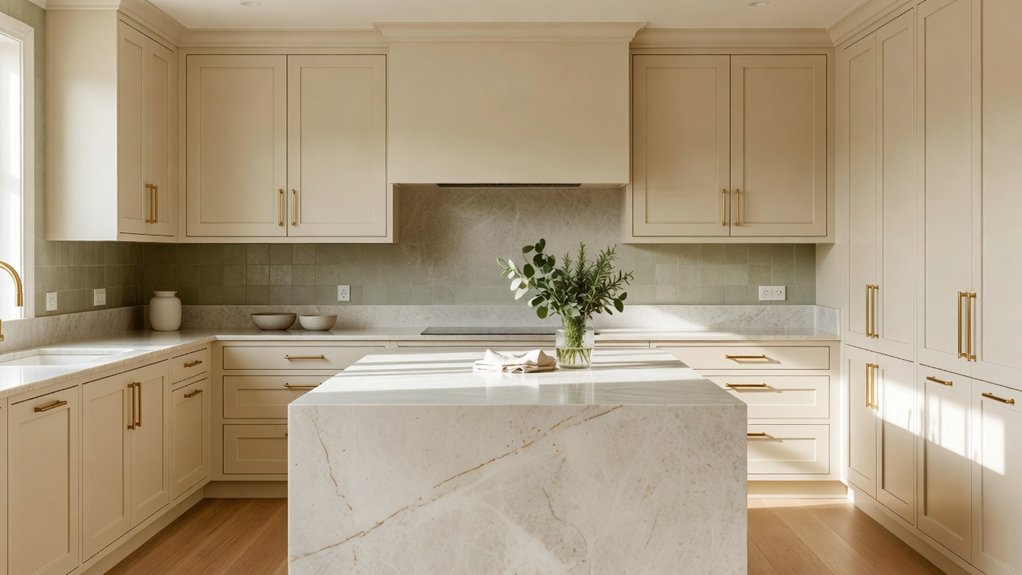
Your kitchen’s light can make a paint color feel warm and welcoming in the morning, then cool and flat by evening. For a timeless scheme, start with your home’s architecture and fixed finishes, then coordinate cabinet, wall, and countertop colors around them. Soft neutrals, muted greens, and earthy tones are dependable starting points, but the best choice depends on your kitchen’s natural light. Test paint samples on different walls and view them throughout the day before deciding. For tailored guidance, Property Sisters Interiors can help you bring the colors and finishes together.
Key Takeaways
- Choose a restrained palette that works with your home’s architecture, existing materials, and personal style.
- Start with a main cabinet color, then balance it with softer wall colors and coordinating countertops.
- Consider how natural light affects color, and test samples in your kitchen at different times of day.
- Add visual interest with complementary backsplash tile and a few thoughtfully chosen accent colors.
- Live with large paint samples for several days, checking their undertones and how the finish looks in different lighting before you commit. For help pulling the palette together, Property Sisters Interiors can offer expert guidance.
Choose a Timeless Kitchen Colour Scheme
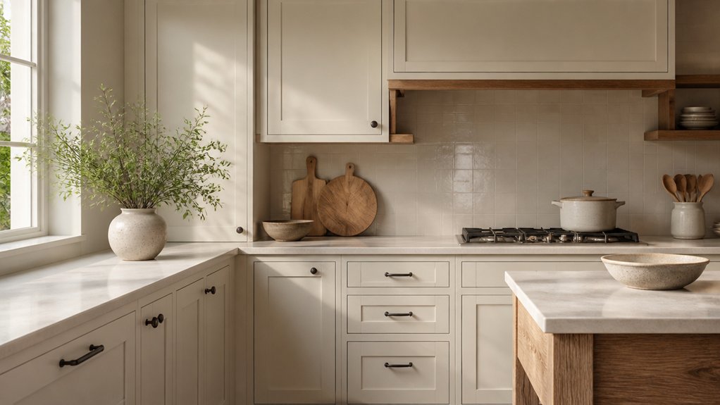
To choose a timeless kitchen color scheme, start with a restrained palette that complements your home’s architecture and the materials you plan to use. Consider how natural light changes throughout the day, and choose colors that feel balanced in both bright and shadowed areas.
Classic palettes offer useful inspiration: soft whites, muted greens, earthy ochres, and deep blues pair well with natural materials and a range of styles. Cultural influences can also guide your choices, from Mediterranean terracotta to Japanese-inspired neutrals.
Treat these ideas as references, not rules—the right scheme should suit your home and your taste.
Before committing, test paint samples on several walls and look at them at different times of day. Choose hues with lasting appeal, and keep distinctive accents easy to update as your preferences change.
If you’d like help bringing the palette together, Property Sisters Interiors can offer expert guidance.
Pair Kitchen Cabinet, Wall and Worktop Colours
Once you’ve settled on a timeless palette, give each color a clear role across your cabinets, walls, and countertops. Choose a dominant shade for the cabinetry, then use a softer wall color to keep the room balanced. A countertop can tie the two together: look for subtle veining or flecks that pick up both tones without competing for attention.
Cabinet door styles also influence the overall feel. Shaker fronts complement classic color pairings, while flat-panel doors give contrasting colors a cleaner, more contemporary look. Test paint and material samples together in your kitchen, alongside your hardware and flooring. Undertones can shift in different lighting, so check samples at several times of day before making a decision.
Choose a wall paint finish for both appearance and everyday use. Washable eggshell or satin finishes are often practical in busy kitchens, where walls may need occasional cleaning. To keep the palette balanced, use a bold color on one main surface and let the other elements provide visual contrast.
For help coordinating your kitchen finishes, Property Sisters Interiors can offer expert guidance.
Match Your Colour Scheme to Natural Light
Because natural light shifts throughout the day, assess your kitchen’s lighting before choosing colors. Note which areas get direct sunlight, when the room feels brightest, and where shadows linger.
North-facing kitchens often receive cooler, steadier light, so warm whites, soft greige, or muted earthy tones can add balance. South-facing rooms can handle cooler shades, while east- and west-facing spaces may look noticeably different from morning to evening.
Test paint samples beside your cabinets and countertops, and view them at different times of day. This helps reveal undertones that a small swatch can hide.
If your kitchen gets little daylight, a warm, light-reflective shade can feel more inviting than stark white. Choose colors that work in changing light, not just under showroom lighting or on a sunny afternoon.
For help comparing options, Property Sisters Interiors can offer expert guidance.
Add Colour With Kitchen Tiles and Accents
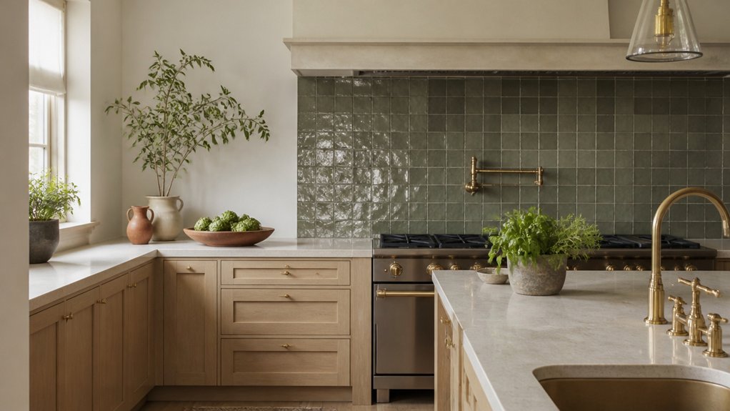
After choosing colours that work with your kitchen’s natural light, add character with tile and accents. A backsplash can introduce texture or a controlled pop of colour without competing with your main palette. Marble-look tiles bring movement and depth, while simple ceramic tiles offer a clean, versatile finish.
Choose grout that complements the tile for a cohesive look.
Repeat one or two accent colours in practical details, such as bar stools, pendant lights, or cookware. Bold accents can energize neutral cabinets, but use them sparingly to keep the room balanced over time.
Coordinate hardware and fixtures, and consider how each finish works with your countertops and flooring.
For help bringing these choices together, Property Sisters Interiors can offer expert guidance.
Test Your Kitchen Colours Before Committing
Before settling on a kitchen color scheme, test your choices in the room itself. Paint large sample boards instead of relying on small chips, then move them around to see how each shade looks next to your cabinets, countertops, flooring, and tile. Check the colors in morning, afternoon, and evening light—daylight and artificial bulbs can shift undertones dramatically.
Think about how a color makes the room feel, too. Soft green may feel restorative, while deep blue can add calm and definition. Choose a mood that suits the way you use your kitchen, not just a color that looks appealing online.
Test your preferred paint finish on the same boards: satin reflects more light and is easy to wipe clean, while matte can soften the appearance of surface flaws but may need gentler care.
Live with your samples for several days before committing. You may spot a mismatch before it becomes a costly mistake.
For help choosing colors and finishes, Property Sisters Interiors can offer expert guidance.
Frequently Asked Questions
Which Kitchen Colours Are Easiest to Keep Clean?
Mid-tone colors—such as warm greige, taupe, and soft gray—typically do the best job of hiding everyday dust, fingerprints, and splashes. Choose durable, easy-to-wipe finishes for added practicality. Stark white and very dark, glossy surfaces can show smudges and water spots more easily. For help choosing a kitchen palette and finishes, contact Property Sisters Interiors.
How Can I Update My Kitchen Colour Scheme on a Budget?
Refresh your kitchen on a budget with paint. Repaint cabinets, walls, or an island in a coordinated color palette, then add a DIY backsplash, updated hardware, and colorful textiles for a fresh look without a major renovation. For help choosing colors and finishes, reach out to Property Sisters Interiors.
Do Colourful Kitchen Appliances Affect Resale Value?
Colorful kitchen appliances can affect resale value, but the impact is typically modest. A coordinated palette and appliances that suit the kitchen’s overall style can appeal to buyers, while bold colors may be less versatile. For flexibility, consider colorful small appliances or removable accents and keep major appliances neutral. Property Sisters Interiors can help you choose finishes that feel personal yet buyer-friendly.
How Often Should I Repaint Kitchen Cabinets?
Kitchen cabinets typically need repainting every 7–10 years, though wear, cleaning habits, and the quality of the original paint can affect the timing. Repaint sooner if you notice peeling, chips, or fading. Thorough surface preparation helps the new finish last, and careful color matching can make small touch-ups blend in between full repaints. For help choosing the right approach, contact Property Sisters Interiors.
Which Paint Finishes Work Best in a Busy Kitchen?
Satin and semi-gloss are practical choices for busy kitchen walls and cabinets because they resist moisture and are easy to wipe clean. For extra durability, consider gloss on trim. Textured walls and accent walls often look best in washable satin. For help choosing a finish that suits your kitchen, contact Property Sisters Interiors.
Conclusion
A timeless kitchen color scheme doesn’t need to follow trends. Start with a restrained palette that suits your home, then balance cabinets, walls, and countertops with natural materials. Notice how daylight changes the room throughout the day, and add color thoughtfully through tile or accents. Before committing, test samples in both bright and shaded areas. A few well-chosen shades can help your kitchen feel cohesive now and for years to come. For personalized guidance, Property Sisters Interiors can help you choose a palette that works for your space.