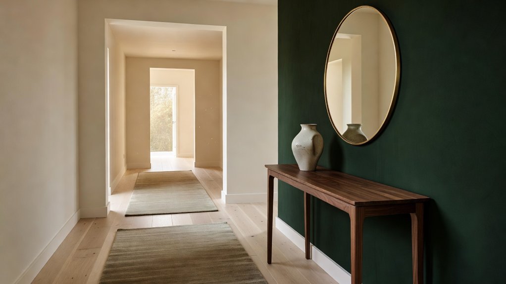
Your hallway sets the tone for the rooms beyond. Choose colors that work with its natural light and proportions to make a narrow entry feel more open or a plain passage feel more intentional. Warm neutrals create a welcoming backdrop, while bold contrasts and muted greens add personality. The best choice often comes down to one detail homeowners overlook: how the light changes throughout the day. Property Sisters Interiors can help you find a palette that suits your home.
Key Takeaways
- Choose soft whites, pale grays, or warm neutrals to make a narrow hallway feel brighter, calmer, and more spacious.
- Try muted sage green or dusty blue for a welcoming touch of color that won’t overwhelm the space.
- Add character with two-tone walls, such as a light upper wall paired with darker wainscoting. The lower finish can also help disguise everyday scuffs.
- Coordinate your hallway color with nearby rooms, flooring, trim, and natural light to create a cohesive first impression.
- Test paint samples at different times of day, and choose a washable eggshell or satin finish for this high-traffic area. For help choosing a palette, consult Property Sisters Interiors.
Choose Hallway Colours for Light and Space
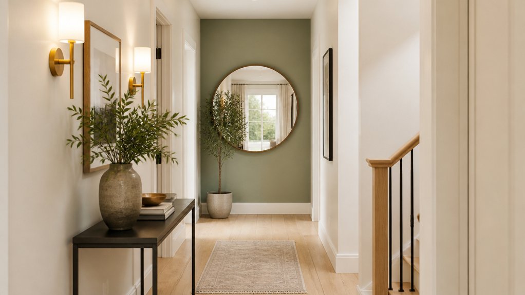
How can color make a hallway feel brighter and more spacious? Start by considering how you want the entrance to feel. Soft whites and warm neutrals can create a calm, open impression, while pale greens or muted blues add personality without overwhelming the space. Choose a shade that works with nearby rooms, flooring, and natural light to make the transition feel intentional.
The paint finish matters, too. Eggshell and satin have a subtle sheen and are typically easier to clean than flat paint, making them practical choices for busy hallways. Test sample patches on different walls and check them throughout the day, since colors can shift as the light changes.
Crisp trim can complete the look with a polished, welcoming touch. For help choosing a cohesive palette, you can consult the experts at Property Sisters Interiors.
Light Hallway Colours for Narrow Spaces
In a narrow hallway, light colors can make the walls feel farther apart and the space more open. Choose soft white, pale gray, or a subtle pastel to reflect daylight and create a calm backdrop. Painting the ceiling a similar shade can help the space feel more continuous, while satin-finish paint can add a gentle glow.
Keep contrast controlled: a slightly deeper tone on doors or trim adds definition without making the corridor feel cramped. Hang a mirror opposite a light source to make the hallway feel brighter and more spacious, and avoid oversized patterns that can crowd the walls.
Add accent lighting along the route to brighten shadowed corners after dark. A small botanical arrangement brings life and texture; choose a slim planter or wall-mounted pot to preserve floor space. For help choosing colors and finishes, Property Sisters Interiors can offer expert guidance.
Warm Neutral Hallway Colour Schemes
Warm neutrals can make your hallway feel welcoming without overwhelming the space. Try soft beige walls with layered cream accents for subtle depth.
Add texture with woven baskets, a matte-finish runner, or natural wood details to keep the palette from feeling flat.
For help choosing colors and finishes, reach out to Property Sisters Interiors.
Soft Beige Walls
Soft beige walls bring warmth to a hallway without making it feel dark or closed in. Choose a shade with subtle yellow or pink undertones to complement your home’s natural light.
In a narrow space, a lighter beige can make the walls feel less imposing, while a deeper tone adds quiet character to a larger entryway.
Pair beige walls with crisp white trim for a clean outline, or add wood details for a more relaxed welcome. If you prefer minimalist decor, keep furnishings simple and let the wall color provide warmth.
For an accent wall, consider painting the far wall a slightly richer beige to add depth without disrupting the calm palette. Test paint samples at different times of day, since changing light can noticeably shift how beige looks.
Property Sisters Interiors can help you choose a shade that works with your hallway’s lighting and finishes.
Layered Cream Tones
Layered cream tones add depth to a hallway while keeping it light and welcoming. Pair warm ivory walls with slightly deeper cream trim or interior doors for subtle contrast that preserves a calm palette.
In a hallway with little natural light, try a creamy shade with a gentle yellow undertone. For a brighter space, a cooler off-white can help balance the look.
Add texture to keep the scheme from feeling flat. A woven runner, linen lampshade, or pale oak console brings dimension while keeping the palette cohesive.
Framed art with soft brown or muted green accents can also draw the eye along the hallway. Layered cream tones work especially well in entryways, creating a warm welcome and a polished, spacious feel.
For help choosing shades and finishes, you can consult the design experts at Property Sisters Interiors.
Bold Hallway Colour Schemes
Bold hallway color schemes can turn a pass-through into a striking part of your home. Choose a saturated shade that suits the natural light: deep teal adds depth to a bright corridor, while warm terracotta brings energy to a narrow space. Test paint samples at different times of day before committing, since limited natural light can change how colors appear.
Add bold accents with a painted door, a vivid runner, or artwork that echoes your chosen hue. For a polished finish, consider contrasting trim, such as crisp white against navy or soft black beside ochre. Keep the flooring and larger furnishings relatively calm so the color feels intentional, not overwhelming.
If you’re unsure where to start, paint one wall and repeat its shade in a few small details. For help choosing a palette that suits your home, Property Sisters Interiors can offer expert guidance. This approach creates a confident welcome without crowding the hallway.
Two-Tone Colours for Hallway Features
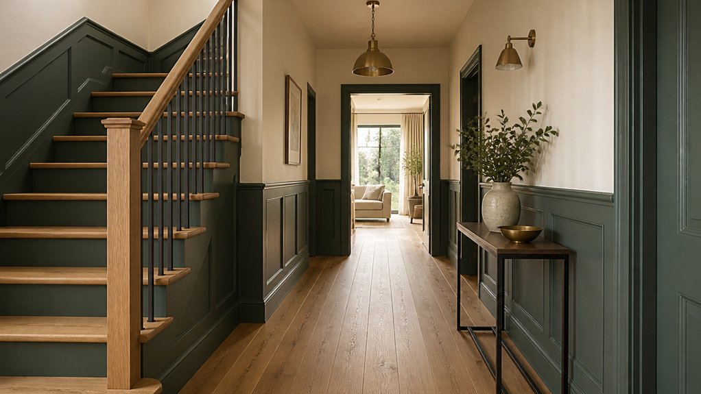
Pair wainscoting with a complementary wall color to define your hallway without making it feel busy. Use a contrasting shade to bring out moldings, door frames, and other architectural details.
Balance light and dark tones to keep the space bright and cohesive. For help choosing colors that work together, Property Sisters Interiors can offer expert guidance.
Wainscoting Colour Pairings
Wainscoting gives you a natural way to introduce two colors in a hallway. Pair a light shade on the upper wall with a deeper tone below to ground the space and help disguise scuffs. Warm white above soft sage, muted blue, or charcoal creates a polished contrast without making a narrow passage feel crowded.
For a softer look, choose colors with similar undertones, such as cream and clay, rather than stark opposites.
Let the wainscoting’s texture guide your paint finish: raised panels pair well with satin paint, while smooth boards look crisp in eggshell. If you use a contrasting accent wall, repeat one wainscoting color on the adjoining wall to keep the scheme connected.
Test paint samples in both daylight and evening light before committing; hallway lighting can noticeably shift how a color looks. Keep the trim consistent for a tidy finish.
For help choosing a cohesive palette, Property Sisters Interiors can offer expert guidance.
Highlighting Architectural Details
Beyond wainscoting, a two-tone color scheme can highlight hallway features such as door frames, arches, or picture rails. Choose one color for the walls and a complementary shade for these architectural accents so each feature feels intentional, not busy.
For a cohesive look, repeat the trim color on baseboards or interior doors. You can also paint decorative molding in a crisp contrasting shade to define its profile and add character to a plain hallway.
Before you begin, plan where each color will meet, especially around curved arches and adjoining rooms. Use painter’s tape for clean edges, and test your color pairing alongside the hallway’s existing finishes.
A restrained palette lets the architecture take center stage while keeping your entryway polished and welcoming. If you’d like help choosing colors or planning the details, Property Sisters Interiors can offer expert guidance.
Balancing Light and Dark
Light and dark tones can give a hallway depth and draw attention to its features. Pair a pale upper wall with a deeper shade below to help a narrow passage feel grounded without making it feel closed in. Contrasting colors, such as warm white and muted olive, create a crisp, welcoming effect. Repeat one color on a door or trim to tie the scheme together.
For a subtler look, try a monochromatic scheme: combine soft gray walls with charcoal paneling, or cream with warm taupe. Keep the darker tone on lower sections, where it can help disguise scuffs, and use lighter paint above to reflect available light.
Test paint samples at different times of day, since hallway lighting can change how colors appear. Balance bold contrasts with simple flooring and restrained accessories for a polished first impression.
For help choosing a palette, you can consult the experts at Property Sisters Interiors.
Calming Greens and Blues for Your Hallway
For a calm, welcoming hallway, try muted greens or soft blues. These nature-inspired palettes bring a gentle connection to the outdoors and help an entry feel warm rather than stark.
Sage or eucalyptus green works especially well in a hallway with warm natural light. In cooler light, these shades can look gray, so test a sample on the wall before committing.
Powder blue or dusty teal adds freshness without overwhelming a narrow space. Pair either color with warm white trim, pale oak, or woven textures for a balanced look.
For a polished finish, echo your chosen color in artwork, a runner, or a small accent. Choose durable, washable paint for areas near doors and busy corners.
If you’d like help selecting colors and finishes, Property Sisters Interiors can offer expert guidance. A thoughtful palette can make your hallway feel soothing, personal, and considered.
Frequently Asked Questions
What Finish Is Best for Hallway Walls?
Choose eggshell or satin for hallway walls. Both offer a subtle sheen and are typically easier to clean and more durable than matte finishes. Eggshell is a good choice for hiding minor surface imperfections, while satin provides a little more sheen and washability. Either can complement decorative wall accents and varied textures. For help choosing the right finish, contact Property Sisters Interiors.
How Do I Choose Hallway Paint That Withstands Scuffs?
Choose a washable satin or semi-gloss paint formulated for stain resistance and durability. These finishes are typically easier to clean than flat paint, which helps in a busy hallway. Check the product label for durability and scrub-resistance information, and test a sample in your hallway’s lighting before committing. For help choosing a finish, you can consult Property Sisters Interiors.
Should Hallway Ceilings Match the Walls?
Hallway ceilings don’t have to match the walls. For a more open feel, choose a lighter ceiling color; for a cozy, enveloping look, carry the wall color overhead. Consider your hallway’s natural light and overall style when choosing a shade. For personalized guidance, get expert help from Property Sisters Interiors.
How Can I Test Paint Colours Before Committing?
Test colors with paint swatches and large sample boards before committing. Move the boards around the room and check each shade in morning, afternoon, and evening light. Compare them with your furnishings and trim, too—colors can look different depending on their surroundings. For help narrowing down your options, reach out to Property Sisters Interiors.
What Lighting Works Best With Hallway Paint Colours?
Choose warm, layered lighting to complement your hallway paint and create an inviting atmosphere. Check how colours look in natural daylight and after dark, then use dimmable sconces or ceiling fixtures to keep the tones balanced. For help choosing the right lighting and paint combination, contact Property Sisters Interiors.
Conclusion
Your hallway color scheme sets the tone for your home, so choose shades that suit its natural light, size, and character. Soft neutrals can make a narrow space feel more open, while warm tones add a welcoming touch. Try bold or two-tone colors to highlight architectural features, or choose calming greens and blues for a more restful feel. Durable finishes and thoughtful accessories help complete the look. Test paint samples in your hallway before deciding, and trust your taste. For expert guidance, Property Sisters Interiors can help you create a great first impression from the moment guests walk in.