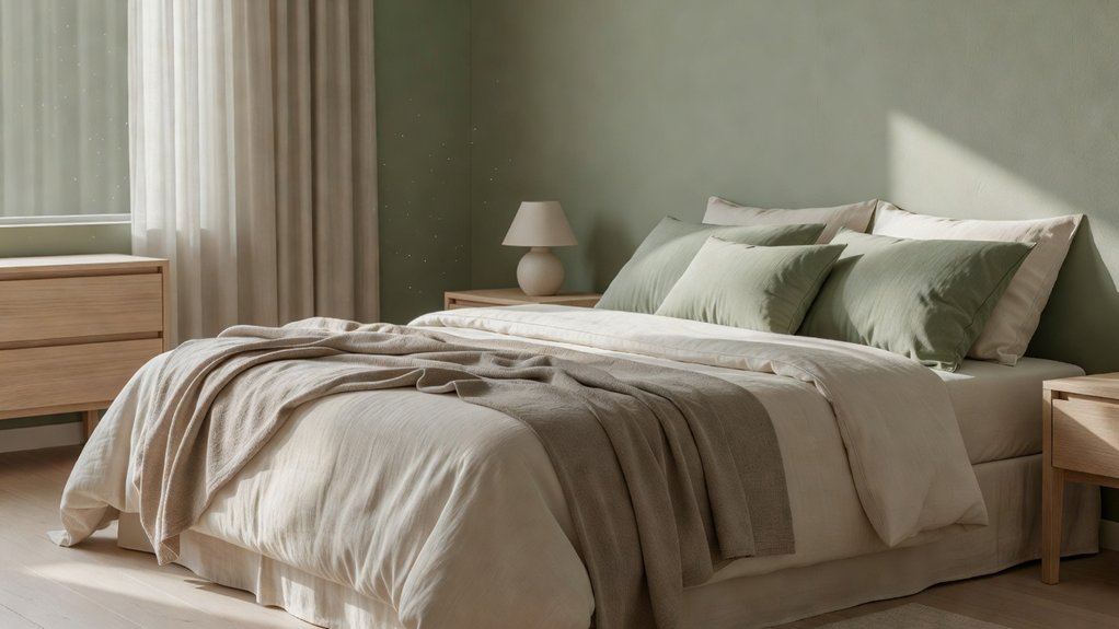
A bedroom can look polished yet still feel too stimulating for restful sleep. The right colour combinations can make the space feel calmer by pairing soothing hues with warm, comfortable tones. Soft blue with warm white can keep a room feeling light, while sage and cream create a grounded look. Muted blush can add softness to warm neutrals. Because natural and artificial light affect how paint colors appear, test samples in your room at different times of day before choosing. For help finding a palette that suits your space, consult Property Sisters Interiors.
Key Takeaways
- Pair soft blue walls or bedding with warm white accents to create a calm, airy bedroom.
- Combine muted sage with beige or cream for a grounded, nature-inspired feel.
- Try dusty rose with pale taupe or other warm neutrals for a cozy, gentle contrast.
- Use bolder colors sparingly, and repeat shades throughout the room to create a cohesive look.
- Test paint samples in both morning and evening light, taking room orientation, furnishings, and flooring into account. For help choosing a restful palette, consult Property Sisters Interiors.
Three Calming Bedroom Colour Combinations
The right color pairing can make your bedroom feel calmer without making it dull. Try soft blue with warm white for a gentle, airy effect. Blue can evoke a sense of calm, while white helps the palette feel clean and uncluttered.
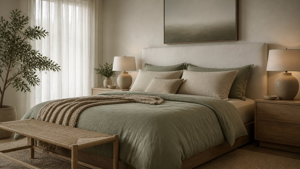
For a grounded look, combine muted sage with beige. This nature-inspired pairing adds warmth without feeling visually heavy.
If you prefer a cozier feel, choose dusty rose with pale taupe. Their subtle contrast brings softness while keeping the room restful.
Use color psychology as a guide, not a rule—your personal response matters, too. To create a cohesive look, repeat each shade in two or three places, such as your bedding, curtains, or a throw pillow.
Keep stronger tones to small accents so the palette feels balanced and easy to live with. For help choosing colors that suit your space, Property Sisters Interiors can offer expert guidance.
Match Bedroom Colours to Light and Style
Test paint samples in your bedroom at different times of day before choosing a shade, since natural and artificial light can change how colors look. Morning sunlight may make a color appear brighter, while evening lamps can deepen it or add warmth.
Consider your room’s orientation: north-facing spaces often benefit from warmer undertones, while strong southern light can balance cooler shades. Check samples alongside your flooring, furniture, and textiles to see how the palette works together.
Use color psychology as a guide, not a rule. Choose hues that feel restful to you and suit your style. For a cohesive look, repeat an undertone in your accessories or trim.
Check colors under your actual light bulbs, then layer task and ambient lighting to keep the room comfortable after dark. If you’d like help choosing a palette, Property Sisters Interiors can offer expert guidance.
Soft Blue and Warm White Bedroom Colours
Pair soft blue with warm white for a bedroom that feels calm without feeling cold. Use blue on the walls or bedding, then bring in warm white through trim, linens, or curtains to keep the room bright and balanced.
Blue is often associated with calm, while warm undertones help prevent the space from feeling stark. Choose a muted shade rather than a highly saturated blue, which can feel too stimulating at bedtime.
Before committing, test paint samples in both morning and evening light—blue can look noticeably different throughout the day. A matte or eggshell wall finish can soften glare and create a more restful feel.
Repeat each color in a few places so the palette looks intentional rather than scattered. If you’d like help choosing shades and finishes, Property Sisters Interiors can offer expert guidance.
Sage Green and Cream Bedroom Colours
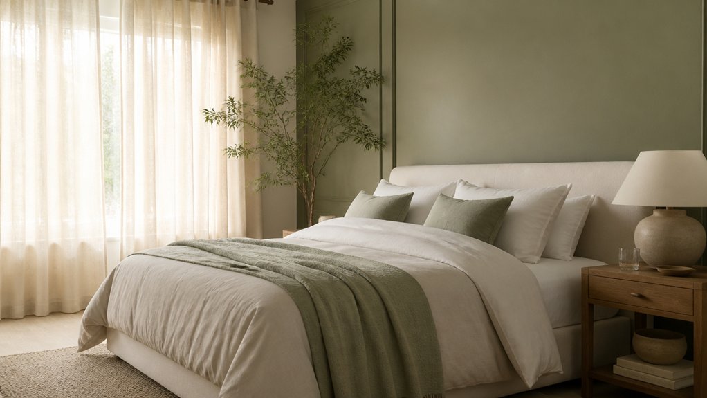
For a softer, nature-inspired alternative to blue, pair sage green with cream for a bedroom that feels calm and welcoming. Paint the walls sage, then bring in cream through bedding, curtains, or a rug to balance the palette.
For a lighter look, reverse the proportions: choose cream walls and add sage with a headboard, pillows, or bedside accents.
Matte or eggshell paint finishes can soften reflected light and create a more restful feel. Add natural textures such as cotton, linen, or wool to give the room depth without visual clutter.
Test paint samples in both morning and evening light, since sage can shift noticeably depending on the exposure. Keep larger surfaces simple and use darker green sparingly for definition.
This pairing works especially well with pale wood and understated decor. If you’d like help choosing colors and finishes, Property Sisters Interiors can offer expert guidance.
Warm Neutrals and Muted Blush for Comfort
Warm neutrals and muted blush can create a gentle, cocooning palette that helps a bedroom feel more restful. Pair soft beige, oatmeal, or warm ivory with dusty rose for a touch of color that won’t overwhelm the room. These subdued shades can feel reassuring and calm, making them a thoughtful choice for a space designed for winding down.
Before choosing paint, test samples in both morning and evening light—blush can appear brighter or cooler as the light changes. Use a warm neutral on most walls, then introduce muted blush on one wall, through textiles, or with accessories.
Matte or low-sheen finishes can soften reflections and maintain a relaxed atmosphere. Ground the palette with natural wood, cream bedding, or brushed brass, and keep strong contrasts to a minimum for a cohesive look.
For help bringing the colors together, Property Sisters Interiors can offer expert guidance.
Frequently Asked Questions
Can Bedroom Colours Affect Sleep Quality?
Yes, bedroom colors can influence how relaxing a space feels. Soft, muted shades may help create a calming atmosphere, while bright or highly saturated hues can feel more energizing. Choose colors you find restful, and consider testing paint samples in different lighting before committing. Property Sisters Interiors can help you select a soothing palette for your bedroom.
Which Paint Finishes Work Best in Bedrooms?
Eggshell or satin paint typically works well in bedrooms. Eggshell has a soft, low sheen that helps reduce glare, while satin is easier to clean and more durable. Choose matte to help disguise minor wall imperfections. For help choosing a finish, contact Property Sisters Interiors.
How Can I Test a Bedroom Colour Before Painting?
Start with color swatches to narrow your options, then paint sample patches on a few walls. Check each shade in the morning, afternoon, and evening, and compare it with your furniture and flooring. If you’d like help choosing, Property Sisters Interiors can offer expert guidance.
Do Bedroom Colours Need to Match the Rest of the Home?
No, your bedroom colors don’t need to match the rest of your home. Think of the room as a quiet retreat: choose shades that support the mood you want, and repeat a few colors or accents from nearby rooms to create a cohesive flow. For personalized guidance, you can get expert help from Property Sisters Interiors.
How Often Should Bedroom Walls Be Repainted?
Repaint bedroom walls every five to seven years, typically, or sooner if you notice peeling, stains, or fading. Choose a durable finish and colors that suit how you use the room. For personalized advice, reach out to Property Sisters Interiors.
Conclusion
Choose a bedroom palette that feels restful in your home’s natural light. Soft blue and warm white can create an airy look, while sage and cream feel grounded. Warm neutrals with muted blush add softness. Test paint samples in both morning and evening light, and use natural textures to make the room inviting without adding visual clutter. Color alone can’t guarantee better sleep, but it can influence how your space feels. Adults need at least seven hours of sleep each night, so make your bedroom a calm place you’ll want to return to. For personalized guidance, Property Sisters Interiors can help you choose colors and finishes that suit your home.