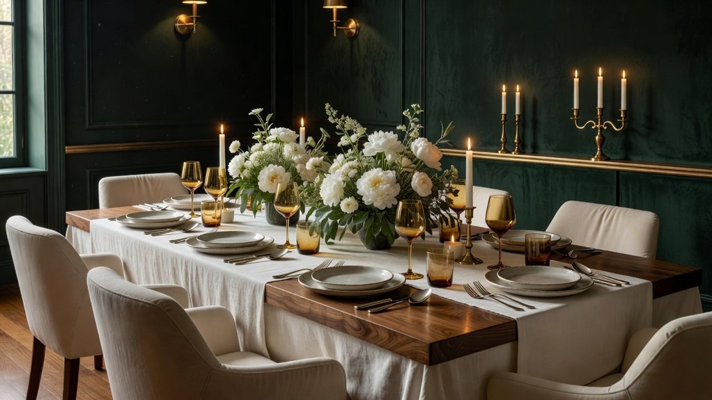
The color you choose for your dining room can shape how guests feel before the first course arrives. Soft greige and warm taupe create a timeless backdrop, while navy, emerald, and aubergine add a more intimate mood. Consider how your colors work with your furniture and lighting, as well as the atmosphere you want to create. Thoughtful pairings can make the room feel polished yet welcoming. For help choosing a scheme that suits your home, Property Sisters Interiors can offer expert guidance.
Key Takeaways
- Choose warm greige, mushroom, or soft taupe for an elegant backdrop that feels welcoming and timeless.
- Pair sage, creamy white, or pale blue with natural wood and woven textures for a fresh, relaxed dining room.
- Set an intimate mood with forest green, navy, or aubergine, balanced by velvet, linen, and warm lighting.
- Coordinate wall colors with your furniture, upholstery, flooring, and metal finishes. Test paint samples in both daylight and evening light before deciding.
- Layer lighting and repeat accent colors in table linens, artwork, or accessories for a polished, cohesive look. For help pulling the palette together, Property Sisters Interiors can offer expert guidance.
Warm Neutral Dining Room Colour Schemes
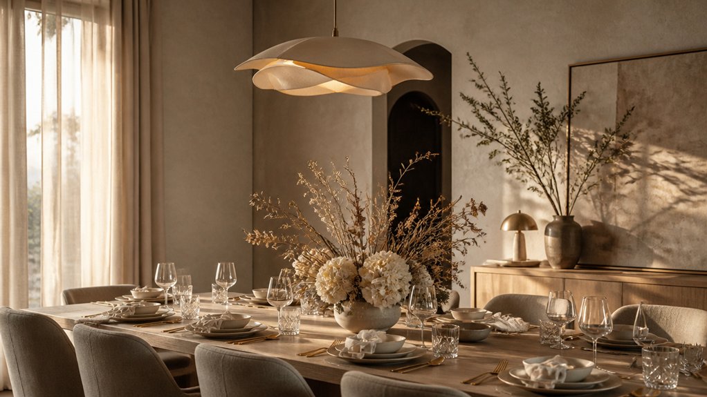
Warm neutral dining room color schemes create an inviting backdrop for entertaining without competing with the food or conversation. Choose shades such as mushroom, camel, or warm greige to add depth while keeping the mood composed. These hues draw on timeless references like aged plaster and natural stone, yet feel current when paired with clean-lined furniture and tactile finishes.
Consider undertones as you choose a color: a touch of ochre can feel welcoming, while soft taupe lends quiet sophistication. Test paint samples beside your flooring and upholstery, since daylight and lamplight can change how a shade looks.
Add contrast with dark wood, brushed brass, or textured linen rather than introducing a busy mix of colors. For help choosing a palette and finishes, Property Sisters Interiors can offer expert guidance. The result is a polished, versatile dining room that feels intimate and ready for relaxed dinners or formal gatherings.
Light, Fresh Colours for Welcoming Meals
For a dining room that feels bright yet inviting, consider soft sage, pale blue, or creamy white. These fresh shades reflect natural light, helping the space feel open while keeping meals relaxed and welcoming.
Pair them with natural wood, woven textures, or brushed brass for a polished look that doesn’t feel stark.
Color psychology can help guide your choice: sage creates a calm, grounded mood, while pale blue feels airy and composed. Creamy white offers a versatile backdrop for art, flowers, and seasonal table settings.
Cultural influences matter, too—familiar colors and handcrafted details can make the room feel personal rather than driven by trends.
Test paint samples in both morning and evening light, and choose a finish that suits your entertaining style and is easy to clean.
For help bringing the colors and finishes together, Property Sisters Interiors can offer expert guidance.
With thoughtful layering, you can create a bright dining room where guests enjoy lingering.
Deep Colours for Intimate Dining Rooms
For a more intimate atmosphere, deep colors like forest green, navy, or aubergine can make a dining room feel cozy and refined. Choose a shade that suits your appetite for drama: paint every wall for an enveloping effect, or use an accent wall to add focus without overwhelming the room.
Balance these rich hues with thoughtful textures, such as velvet dining chairs or curtains, to bring warmth to evening gatherings. For a subtler touch, introduce deep color through artwork, table linens, or a painted ceiling.
Repeat one or two shades in smaller details to keep the palette cohesive. The result is a polished, personal dining room that invites guests to linger.
For help choosing colors and finishes, Property Sisters Interiors can offer expert guidance.
Match Dining Room Colours to Furniture and Lighting
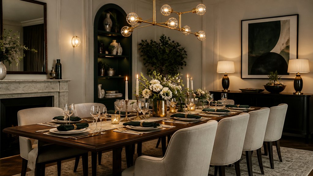
To create a balanced dining room, choose wall colors that complement your furniture’s materials and tones. Warm oak pairs beautifully with soft sage or creamy white, while walnut gains depth beside muted blue or clay. If your table has a pronounced grain, keep nearby colors restrained so its character stands out.
For upholstered chairs, repeat a shade from the fabric on the walls or in accents for a thoughtful, cohesive look.
Lighting can change how every color appears. Test paint samples in daylight and under your evening fixtures before making a decision; warm bulbs can enrich earthy shades, while cooler light may make pale neutrals feel crisper.
Coordinate wall colors with metal finishes, textiles, and artwork to create a balanced palette. Thoughtful contrast keeps the room polished without making it feel overly matched, and layered lighting helps it feel inviting throughout dinner.
For personalized guidance, Property Sisters Interiors can help you bring the colors and finishes together.
Frequently Asked Questions
How Can I Choose Dining Room Colours That Complement an Open-Plan Layout?
Choose one or two colors to carry through adjoining areas, then add subtle contrasts to give the dining zone its own identity. Coordinate furniture finishes, layer in texture, and stick with consistent undertones for a cohesive open-plan look. For help choosing a palette, reach out to Property Sisters Interiors.
Which Dining Room Colours Are Easiest to Maintain in Homes With Children?
Choose mid-tone taupe, warm greige, or muted olive for a dining room that’s easier to keep looking fresh. These shades tend to hide everyday smudges better than pale colors. For added practicality, pair them with a washable, stain-resistant paint finish, so you can clean up spills without giving up style. For help choosing a color and finish that suit your home, reach out to Property Sisters Interiors.
How Often Should I Repaint My Dining Room?
Repaint your dining room every five to seven years, or sooner if you notice scuffs, fading, or want a change. Choose a color that suits the mood you want and works with the room’s lighting and furnishings. For help selecting a color or planning the project, reach out to Property Sisters Interiors.
Can Wallpaper Work Well in a Dining Room?
Yes, wallpaper can work beautifully in a dining room, adding color, texture, and personality. Choose a pattern and finish that suit the room’s light, furnishings, and how you use the space. For help finding the right look, you can consult Property Sisters Interiors.
How Can I Use Colour to Make a Small Dining Room Feel Larger?
Use pale, cool colors on the walls and ceiling to make a small dining room feel more open. Choose calming shades, and use an accent wall for subtle contrast. Pair the colors with light furnishings to keep the space feeling airy. For help choosing a palette, reach out to Property Sisters Interiors.
Conclusion
Think of your dining room as a gracious host: warm greige and taupe create a welcoming backdrop, while lighter shades keep the space feeling open and bright. For a more intimate mood, consider navy, emerald, or aubergine. Let your furniture guide the palette, and use layered lighting to bring out the colors and finishes. Brushed brass accents and tactile linens add warmth and texture. Focus on balance rather than trends to create a polished, personal room that’s ready for memorable gatherings. For help choosing a palette, Property Sisters Interiors can offer expert guidance.