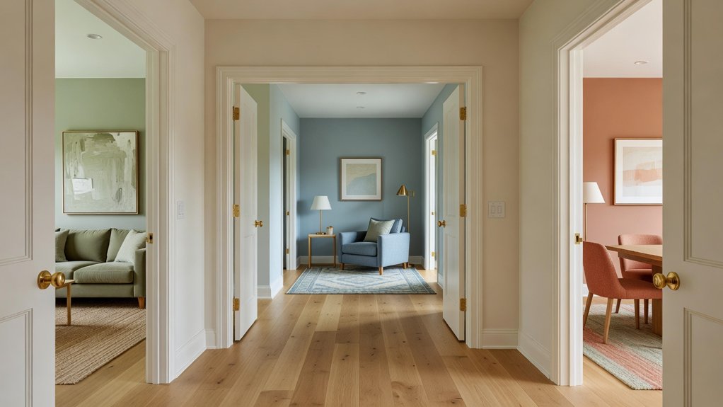
A cohesive whole-house color scheme depends as much on undertones and sightlines as on the colors themselves. Begin with a shared palette and a base color for connected spaces, then adjust shades and accents to suit each room’s lighting and purpose. Test paint samples at different times of day before committing; a small shift in undertone can affect how rooms flow together. If you’d like a second opinion, Property Sisters Interiors can help you bring the palette together.
Key Takeaways
- Choose a small, coordinated palette of versatile neutrals and complementary accent colors to use throughout the home.
- Test large paint samples alongside flooring, furniture, and other fixed finishes in each room and under different lighting conditions.
- Repeat shared hues in artwork, textiles, or accessories to connect rooms while giving each space its own character.
- Adjust color depth and warmth to suit each room’s purpose, while keeping undertones consistent for a natural flow.
- Check how colors look through doorways and along sightlines, then live with the samples for several days before settling on a scheme. For extra guidance, Property Sisters Interiors can help you create a cohesive palette.
Build a Whole-House Colour Palette
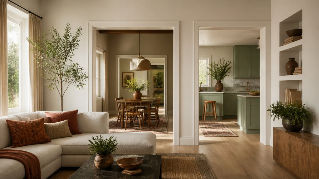
Start your whole-house color palette with a few shades that work well together instead of choosing a different color for every room. Think about how you want each space to feel, and use color psychology as a guide: muted greens can feel restful, while warm terracotta can add energy.
Historical inspiration can help, too. Period homes often pair earthy hues with soft neutrals for a grounded look that feels less tied to trends.
Gather paint chips, fabric samples, and flooring references, then compare them in both natural and artificial light. Look for shades that repeat in your furnishings and finishes; they can help tie your choices together.
Choose a small group of related colors, including a few accents, and test them in different rooms before committing. You’ll have flexibility while keeping your home visually connected.
For help refining your palette, Property Sisters Interiors can offer expert guidance.
Choose a Base Colour for Shared Spaces
Choose a versatile neutral for shared spaces to create a calm backdrop that works with your color palette.
Repeat the base color in connecting rooms to make your home feel cohesive, and vary the shades or finishes to keep the look from feeling too uniform.
For help choosing colors that work throughout your home, reach out to Property Sisters Interiors.
Select a Versatile Neutral
A versatile neutral gives shared spaces a cohesive foundation without limiting your options. Choose a shade that suits your home’s natural light, finishes, and overall mood. Warm whites, soft greiges, and muted taupes can each work well, but their undertones and surroundings affect how they look.
Test samples on several walls and observe them in morning, afternoon, and evening light. Compare each shade with your flooring, cabinetry, and other fixed finishes so it feels intentional rather than disconnected.
Consider how much contrast you want: a lighter neutral can brighten a dim hallway, while a deeper tone may add definition to a sunlit living area.
Prioritize versatility, but don’t settle for a shade that feels generic. Your base color should work across shared spaces and still reflect your preferences.
If you’d like help choosing, Property Sisters Interiors can offer expert guidance.
Repeat the Base Colour
Once you’ve chosen a versatile neutral, repeat it in shared spaces such as hallways, living rooms, and dining areas. Using the same base color in these connecting areas creates visual continuity and helps your home feel thoughtfully coordinated rather than divided into unrelated rooms.
You don’t have to use it in exactly the same way everywhere. Adjust the shade, finish, or amount of coverage to suit each space. For example, a lighter neutral can help a narrow hallway feel more open, while the same color can cover more wall space in an open-plan living room.
Keep the undertones consistent so the color flows naturally from room to room, then add personality with furnishings, artwork, and textiles. This approach creates harmony without making every space look alike, and gives you a practical backdrop as your decor evolves.
If you’d like help choosing a palette that works throughout your home, Property Sisters Interiors can offer expert guidance.
Check Undertones and Natural Light
Before choosing a whole-house palette, see how each color’s undertones work with your fixed finishes and natural light. Look for subtle warm, cool, or green casts that might clash with flooring, stone, cabinetry, or trim. Hold paint samples next to these materials rather than judging them on their own, and compare them in both daylight and evening light.
Natural light can change how a color looks throughout the day. North-facing rooms often make shades appear cooler, while strong southern exposure can bring out their warmth. Light in east- and west-facing rooms shifts noticeably as the sun moves.
Test large samples on different walls and check them in the morning, at midday, and at dusk. Look at adjoining spaces, too, to make sure transitions feel intentional. If a color turns unexpectedly pink, gray, or yellow, consider adjusting its undertone before committing.
For a second opinion, Property Sisters Interiors can help you evaluate colors in your home.
Vary Shades and Accents by Room
Keep a consistent color palette throughout your home, but vary the shades and accents to suit each room.
In a bedroom, choose softer versions of your main colors to create a restful atmosphere.
In a kitchen or dining area, consider deeper tones that feel lively and suit spaces with frequent activity.
You can also adjust how much color each room gets. Paint an accent wall to add depth without overwhelming a small space, or use a stronger shade on all the walls in a larger room.
Consider how your furniture will contrast with the paint: light upholstery can stand out against a rich wall color, while dark furniture may feel more balanced with pale, warm surroundings.
Test paint samples in each room at different times of day, then choose shades that complement the room’s purpose and proportions.
For help selecting colors and finishes, consult the experts at Property Sisters Interiors.
Repeat Accent Colours to Connect Rooms
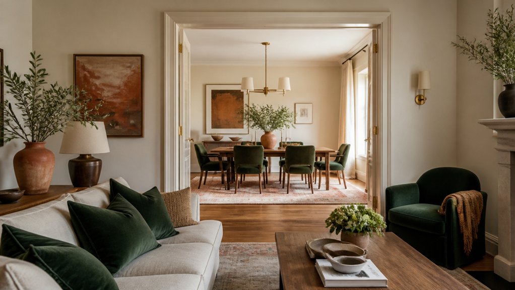
Choose a consistent accent palette to create a visual thread through your home. Repeat the colours thoughtfully, but vary how you use them in each room.
This keeps your scheme cohesive without making every room feel identical. If you’d like help pulling the palette together, Property Sisters Interiors can offer expert guidance.
Choose a Consistent Accent Palette
A consistent accent palette helps your rooms feel connected without making them look identical. Choose two or three accent colors that complement your main wall shades and create the mood you want throughout your home. Consider how each color looks in different lighting, and test paint or fabric samples before committing.
Use contrasting accent colors to add definition: pair deep blue with warm neutrals, or balance terracotta with soft green. You don’t need to give every accent equal weight. Let one shade lead in a room while another takes a quieter role in smaller details.
A statement wall can showcase a bolder color, as long as it works with the palette elsewhere in your home.
Keep the combination flexible enough to work with your furniture, artwork, and changing needs while maintaining visual balance. If you’d like help choosing colors that feel cohesive throughout your home, Property Sisters Interiors can offer expert guidance.
Repeat Colours Thoughtfully
To connect rooms without making them feel repetitive, repeat accent colors in small, deliberate ways. Carry one or two shades from your palette through adjoining spaces in details such as cushions, artwork, ceramics, or a lampshade. This thoughtful repetition helps your home feel cohesive while allowing each room to express its own character.
Choose accents that complement a room’s dominant colors rather than forcing an exact match. A muted blue might pair with warm neutrals in one space and deeper wood tones in another. Check how colors look in different lighting, since the same shade can appear different from room to room.
With a consistent palette and a light touch, you can create a natural flow while keeping each space distinct. For help choosing colors that work throughout your home, Property Sisters Interiors can offer expert guidance.
Vary Placement Between Rooms
As you repeat accent colors from room to room, vary where they appear so your home feels connected rather than copied. In the living room, you might use deep green on cushions; in the adjoining dining room, bring that hue into a lampshade or table linens. The palette stays consistent, while each space keeps its own character.
Consider furniture placement when deciding where color will have the greatest impact. A painted chair can echo an accent wall in a nearby room without repeating the same treatment. Artwork is another flexible link: choose pieces with a shared accent color, then vary their size, frames, or placement from room to room.
These thoughtful shifts create a natural visual rhythm as you move through the home. Keep each accent intentional, and balance bolder color moments with quieter, neutral surfaces. For help creating a cohesive palette throughout your home, Property Sisters Interiors can offer expert guidance.
Match Colours to Each Room’s Function
Each room’s purpose should guide its color choices. The right palette can support how you want a space to feel and function. Consider the mood you want in each room, then choose hues that help create it.
In a bedroom, muted greens, blues, or warm neutrals can encourage rest. In a home office, soft blue or restrained green can support focus without feeling stark.
In a kitchen or dining area, warmer tones can make the space feel welcoming and sociable. For busy hallways and family rooms, practical midtones can handle daily activity while connecting with nearby rooms.
You don’t need a different color in every space; adjust the depth or warmth of a shared palette to suit each room’s role. If you’d like help bringing the colors together, Property Sisters Interiors can offer expert guidance.
Test Paint Colours Before You Commit
Once you’ve chosen colors that suit each room, test them in place before buying paint. Samples show how each shade looks with your furnishings, flooring, and nearby rooms. Paint large swatches on several walls, or use movable sample boards to compare colors in different spots.
Check them in the morning, midday, and evening under both natural and artificial light. Light can shift a color’s warmth, depth, and undertone, affecting how it feels alongside the rest of your home. View samples near doorways and along sightlines to make sure the transitions feel balanced.
Live with your favorites for a few days before deciding. Once you’ve settled on a color, buy enough paint to finish each room at once, since different batches may vary slightly.
For help choosing and testing colors, Property Sisters Interiors can offer expert guidance.
Frequently Asked Questions
Should a Whole-House Colour Scheme Include the Exterior?
Yes. Include your exterior in your whole-house colour scheme, but don’t feel you need to match every interior shade. Choose complementary colours that suit your home’s character and surroundings, enhance curb appeal, and create a welcoming transition from outdoors to indoors. Property Sisters Interiors can help you bring the palette together.
How Can Renters Create a Cohesive Colour Scheme Without Repainting?
Create a cohesive rental without repainting by choosing a consistent palette and repeating its colors in textiles, rugs, and artwork. Carry a few accent hues from room to room, and use renter-friendly options like removable wallpaper and decorative accessories to add personality. For help pulling the look together, consult Property Sisters Interiors.
Do Ceilings and Trim Need to Follow the Same Colour Palette?
No—your ceilings and trim don’t have to be the same color, but they should work with the rest of your palette. A contrasting ceiling can add depth, while coordinated trim helps rooms flow together. Repeating colors or finishes throughout your home creates a polished, cohesive look. For help choosing a palette, you can work with Property Sisters Interiors.
How Can Artwork and Furniture Fit Into a Whole-House Colour Scheme?
Like a well-composed symphony, artwork and furniture should complement your whole-house colour palette without matching it exactly. Place art to echo accent hues, and coordinate furniture to balance neutrals, textures, and statement pieces throughout your home. For help bringing the look together, consult the experts at Property Sisters Interiors.
Should Adjoining Rooms With Different Flooring Use the Same Wall Colours?
You don’t need to use the same wall color in adjoining rooms with different flooring. Choose related shades to create a sense of continuity, then adjust the undertones to complement each floor. A subtle color contrast can help define the transition between rooms while keeping the overall look cohesive. For help coordinating flooring and wall colors, you can consult Property Sisters Interiors.
Conclusion
A cohesive whole-house color scheme doesn’t mean every room needs the same shade. Start with a shared palette, check how undertones look in different lighting, and adjust the colors’ intensity to suit each room. Repeat a few accents to create a natural flow between spaces, especially along open sightlines. Before committing, test paint samples on your walls and observe them throughout the day. For help pulling the palette together, Property Sisters Interiors can offer expert guidance. The goal is a home that feels connected, not color-coded.