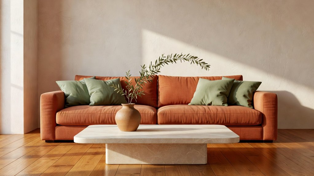
Earthy tones can bring warmth and calm to your home without relying on bold color. Use terracotta for a grounded accent, sage for a softer touch, and stone as a versatile neutral across rooms. Balance the palette with natural materials, layered textures, and thoughtful contrast. A few well-chosen details can make the look feel cohesive rather than themed, while room-specific choices keep each space inviting. For help bringing the palette together, you can consult Property Sisters Interiors.
Key Takeaways
- Start with a warm neutral base, then use terracotta and sage as supporting colors for a balanced palette.
- Add terracotta through an accent wall, textiles, or decor, and soften its warmth with cream, wood, or stone.
- Use sage on walls, cabinetry, or upholstery, pairing it with linen and warm wood for a calm, natural feel.
- Bring in stone through details such as a sink, shelf, or backsplash. Choose a finish that suits the room and your maintenance preferences.
- Layer natural textures like linen, wool, wood, and woven materials. Test paint samples in different lighting throughout the day before you commit. For help bringing the palette together, Property Sisters Interiors can offer expert guidance.
Build a Balanced Earthy-Tone Palette
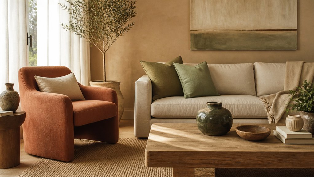
To build a balanced earthy-tone palette, start with a warm neutral—such as cream, sand, or taupe—as your base. Then layer in richer shades like terracotta, olive, or rust. Use one neutral as the dominant color and choose two supporting hues to add depth without making the room feel busy.
Pay attention to undertones. Pink-based terracotta pairs naturally with warm cream, while gray-green olive works well with cooler stone tones. Muted greens can create a restful feel, while rust adds warmth and energy.
Materials and cultural influences also affect how earthy colors look and feel, so consider the finishes and traditions that inspire your choices.
Test paint swatches in different daylight conditions before committing, and check that adjoining rooms feel consistent in temperature.
If you’d like help pulling the palette together, Property Sisters Interiors can offer expert guidance. A restrained color scheme lets architectural details stand out.
Layer Earthy Colors With Paint and Textiles
Once your palette feels balanced, use paint to set the foundation and textiles to add depth. Choose a wall color that works with the room’s natural light: warm stone can soften a bright space, while muted sage can bring calm to a shaded one. Test large paint swatches at different times of day before committing.
Repeat your chosen hues in curtains, cushions, rugs, and throws. The shades don’t have to match exactly—subtle variations create harmony and keep the scheme from feeling flat. Pair a terracotta cushion with dusty rose or rust, for example, then balance it with sage or stone textiles.
For added texture, mix smooth cotton with linen, wool, or velvet, and keep patterns restrained. If your walls have a strong color, choose quieter textiles; if the paint is neutral, let a patterned fabric take the lead. This balance helps the room feel cohesive and comfortable.
For help choosing colors and materials, Property Sisters Interiors can offer expert guidance.
Pair Terracotta, Sage, and Stone With Natural Materials
Pair terracotta with natural wood to add warmth and highlight the wood’s grain. Balance sage and stone with linen for a soft, calming texture.
Choose finishes and fabrics that work together without competing for attention.
For help pulling the palette together, reach out to Property Sisters Interiors.
Terracotta With Natural Wood
Terracotta brings warmth to natural wood, while sage and stone tones add balance. Pair a clay-colored wall with oak flooring or a walnut dining table to create a grounded focal point.
Wood’s natural texture adds depth to terracotta’s matte, sunbaked finish, so you can keep decorative accents simple. Choose one dominant wood tone and repeat it in smaller details, such as frames or shelving, for a cohesive look.
For an earthy contrast, pair rust-toned cushions with pale ash wood, or place a terracotta vase on a dark wood console. Keep the palette balanced so neither the wood nor the terracotta overwhelms the room.
If your furniture has pronounced grain, opt for simpler terracotta shapes to avoid visual clutter. Test paint and fabric samples beside your wood in different lighting, since undertones can shift throughout the day.
For help bringing the materials together, consult the designers at Property Sisters Interiors.
Sage and Stone With Linen
To balance terracotta’s warmth, pair it with sage, stone, and linen. Sage cushions or painted cabinetry introduce a muted green that tempers clay’s intensity, while stone surfaces add a grounded, tactile contrast.
Together, these earthy tones create a welcoming, restful feel with a sense of stability. Linen textures help tie the palette together without making the room feel too coordinated.
Choose a natural flax shade for curtains, upholstery, or a relaxed tablecloth. Its subtle weave catches the light and softens the harder edges of stone and tile.
Keep terracotta to smaller accents, such as a planter or ceramic lamp, so sage and linen can take the lead. Repeat a stone hue in a few accessories for cohesion, and vary finishes to add depth.
For help pulling the palette together, Property Sisters Interiors can offer expert guidance.
Use Terracotta to Warm Up Living Rooms
Use a terracotta accent wall to create a warm, grounded focal point in your living room. Echo the color with cozy textiles and a rug.
Then balance its richness with neutral upholstery, wood, or stone so the space feels inviting rather than heavy.
For help choosing the right shade and finishes, reach out to Property Sisters Interiors.
Terracotta Accent Walls
A terracotta accent wall can make your living room feel warmer and more grounded without overwhelming the space. Choose a wall that naturally draws the eye, such as the one behind your sofa or fireplace.
Terracotta works especially well in rooms with plenty of natural light, which can bring out the paint’s subtle red and clay undertones. In a darker room, try a lighter, more muted shade to keep the space from feeling enclosed.
Balance terracotta with warm white, cream, or soft gray on nearby walls, then repeat the color in a few small accents for a cohesive look. Natural wood and black metal add contrast without competing for attention.
Before committing, test paint samples at different times of day, since changing light can noticeably shift the color. For help choosing a shade and creating a balanced palette, consult the experts at Property Sisters Interiors.
Warm Textiles and Rugs
Terracotta textiles can warm a living room without the commitment of paint. Drape cozy woven throws over a sofa or armchair to add color and texture where you need it most. Choose rust, clay, or muted red tones that complement your upholstery, then repeat the shade in a cushion or two for a pulled-together look.
A rug can make the color feel more substantial. Place a plush area rug beneath your seating group to anchor the furniture and soften hard floors. For a cohesive effect, choose a pattern that includes terracotta alongside other colors already in the room.
Before buying, check the rug dimensions: the front legs of each seat should rest on the rug to help connect the arrangement. For more flexibility, layer a smaller terracotta rug over a larger neutral one and switch out the throws with the seasons.
Property Sisters Interiors can help you choose textiles and rugs that work with your space.
Balance With Neutrals
How can you keep terracotta from overwhelming a living room? Pair it with quiet neutrals that let its warmth breathe. Paint the walls soft white, warm gray, or pale stone, then bring in terracotta through a sofa, accent chairs, cushions, or a single painted feature. This balance creates a welcoming focal point without making the room feel heavy.
Consider color psychology when choosing your mix: terracotta feels energizing and grounded, while muted neutrals bring a sense of calm. The color also evokes clay, craftsmanship, and the natural landscape. Echo those qualities with wood, linen, or handmade ceramics, and vary the textures to keep the palette layered.
If your room gets little natural light, choose lighter neutrals and use terracotta sparingly. In a bright room, deeper accents can add definition. For help finding the right balance for your space, Property Sisters Interiors can offer expert guidance.
Bring Sage Into Calm, Nature-Inspired Rooms
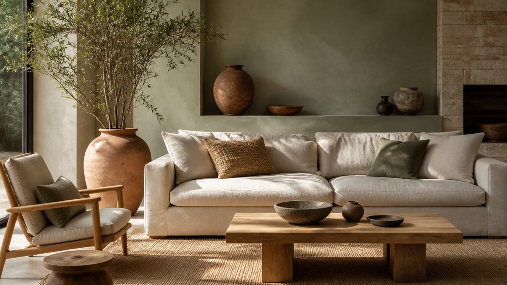
When you want a room to feel calm without looking cool or sterile, consider sage—a muted green that pairs naturally with warm wood, linen, and stone. Use it on walls, cabinetry, or a single upholstered piece, then layer in cream and sand for gentle contrast. Before committing, test a sample in morning and evening light.
Depending on its undertone and the room’s exposure, sage can shift from gray to olive.
Add texture with woven shades, cotton throws, and matte ceramics instead of introducing more competing colors. A few leafy accents can reinforce the nature-inspired mood; choose plants suited to your light and watering routine.
Keep furniture lines simple and leave breathing room around key pieces so sage feels intentional, not merely decorative. For help choosing colors and finishes, Property Sisters Interiors can offer expert guidance.
Add Stone Tones to Kitchens and Bathrooms
Stone tones bring a grounded, timeless feel to kitchens and bathrooms while still adding warmth. Use limestone, travertine, or slate on floors, countertops, or backsplashes to create texture and visual depth. Honed finishes offer a softer look and can provide better traction underfoot. Because some natural stones are porous, seal them as recommended to help protect against stains and moisture.
Stone accents don’t have to dominate a room. Try a stone sink, shelf, or backsplash, then pair it with warm wood, brushed brass, or matte black fixtures. For an earthy palette, combine pale sand or warm gray stone with sage cabinetry, terracotta details, or creamy walls.
In a compact room, keep larger surfaces light and repeat a stone tone in smaller elements for a cohesive look.
Before choosing a material, check its care requirements—especially for shower surrounds and areas near the stove or sink. Property Sisters Interiors can help you select stone finishes that suit your style, space, and maintenance preferences.
Frequently Asked Questions
Do Earthy Tones Work in Small Rooms?
Yes, earthy tones can work beautifully in small rooms. Balance deeper shades with lighter neutrals, and use varied textures to add depth without making the space feel busy. Mirrors and layered lighting can help the room feel more open. For personalized guidance, get expert help from Property Sisters Interiors.
Which Lighting Best Complements Earthy Color Schemes?
Warm, layered lighting pairs naturally with earthy color schemes. Make the most of daylight, then use dimmable, warm-white LED bulbs to create a comfortable glow. Shaded lamps, wall sconces, and indirect lighting can soften terracotta, sage, and stone tones. For help choosing lighting that suits your home, reach out to Property Sisters Interiors.
Are Earthy Tones Suitable for Modern Interiors?
Yes, earthy tones can work beautifully in modern interiors. Pair muted terracotta, sage, and stone with clean lines and natural textures for a warm, uncluttered look. Thoughtful cultural influences can add character without overwhelming the space. For personalized guidance, homeowners can get expert help from Property Sisters Interiors.
How Can I Update an Earthy Palette Seasonally?
Refresh your earthy palette with the seasons by switching out cushions, throws, and smaller accents. Ease from warmer to cooler hues—or back again—with gradual color shifts, and layer in natural textures such as linen, wool, and woven accessories for added warmth and depth. For a tailored seasonal update, Property Sisters Interiors can help.
What Accent Colors Pair Well With Earthy Tones?
Pair earthy tones with navy, mustard, rust, or blush for a balanced contrast. For added depth, consider an accent wall in deep blue or muted plum, and use complementary colors as a guide without making the room feel overwhelming. Property Sisters Interiors can help you choose a palette that suits your home.
Conclusion
Terracotta, sage, and stone can do more than coordinate a color palette—they can shape the mood of your home. Choose one shade as a starting point, then layer in natural materials and softer accents to create a balanced look. Consider how each color feels in different rooms and how it works with your lighting, furniture, and finishes. For help bringing earthy tones together, Property Sisters Interiors can offer expert guidance.